
FGCU360 Magazine Layout
As part of one of my design courses, I created this mock magazine design layout. The article featured is taken from a past issue of FGCU360 magazine.
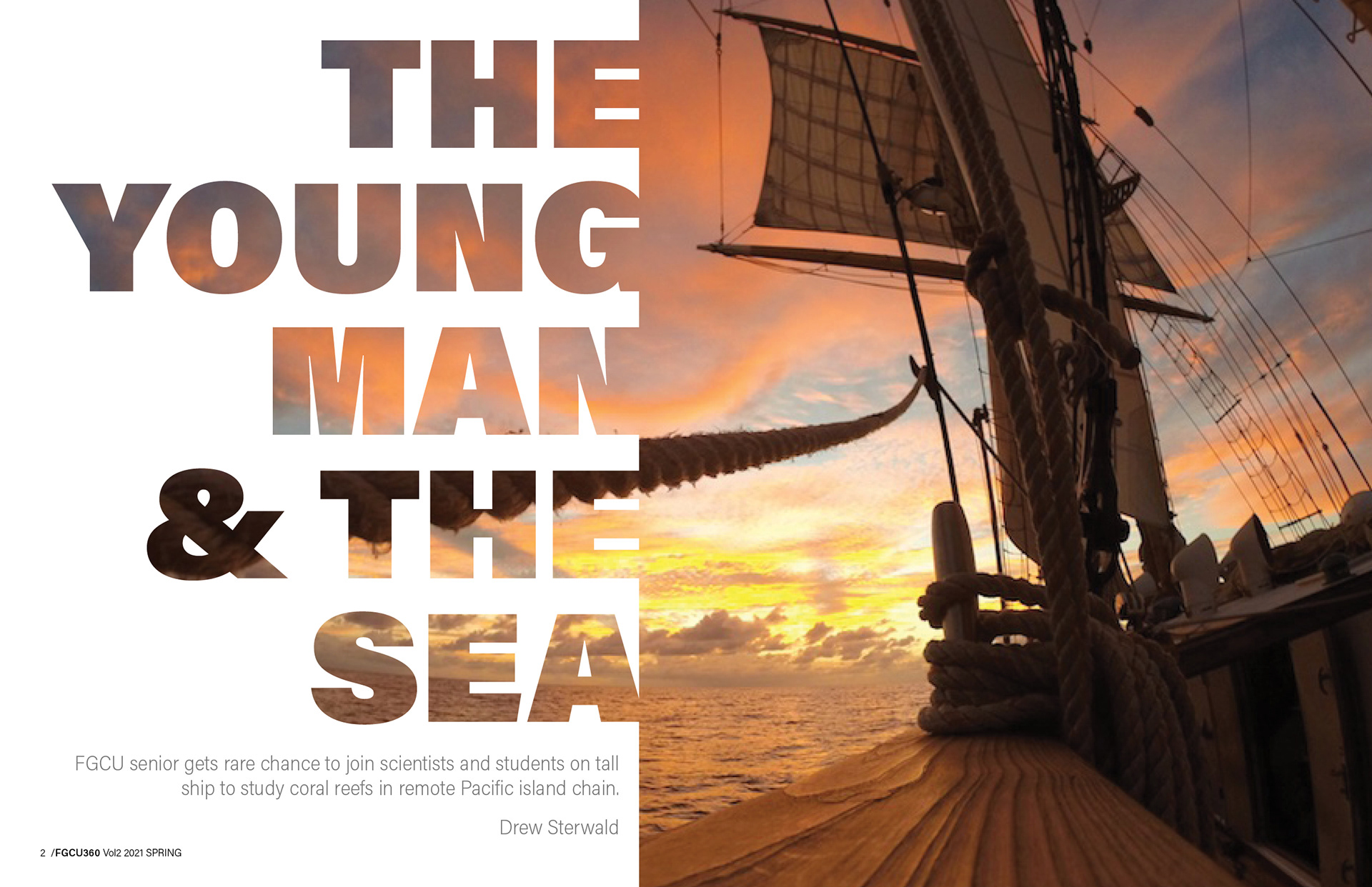
When I started my design I knew I wanted to feature a large image on the main (first) title page to really draw in the attention of the reader. I used a clipping mask to incorporate the title with the photograph. I did not want the two pages to appear disjointed, and this effect helped unite them, so the reader's eye is led across the page nicely.
...........................................................................................................................................................................
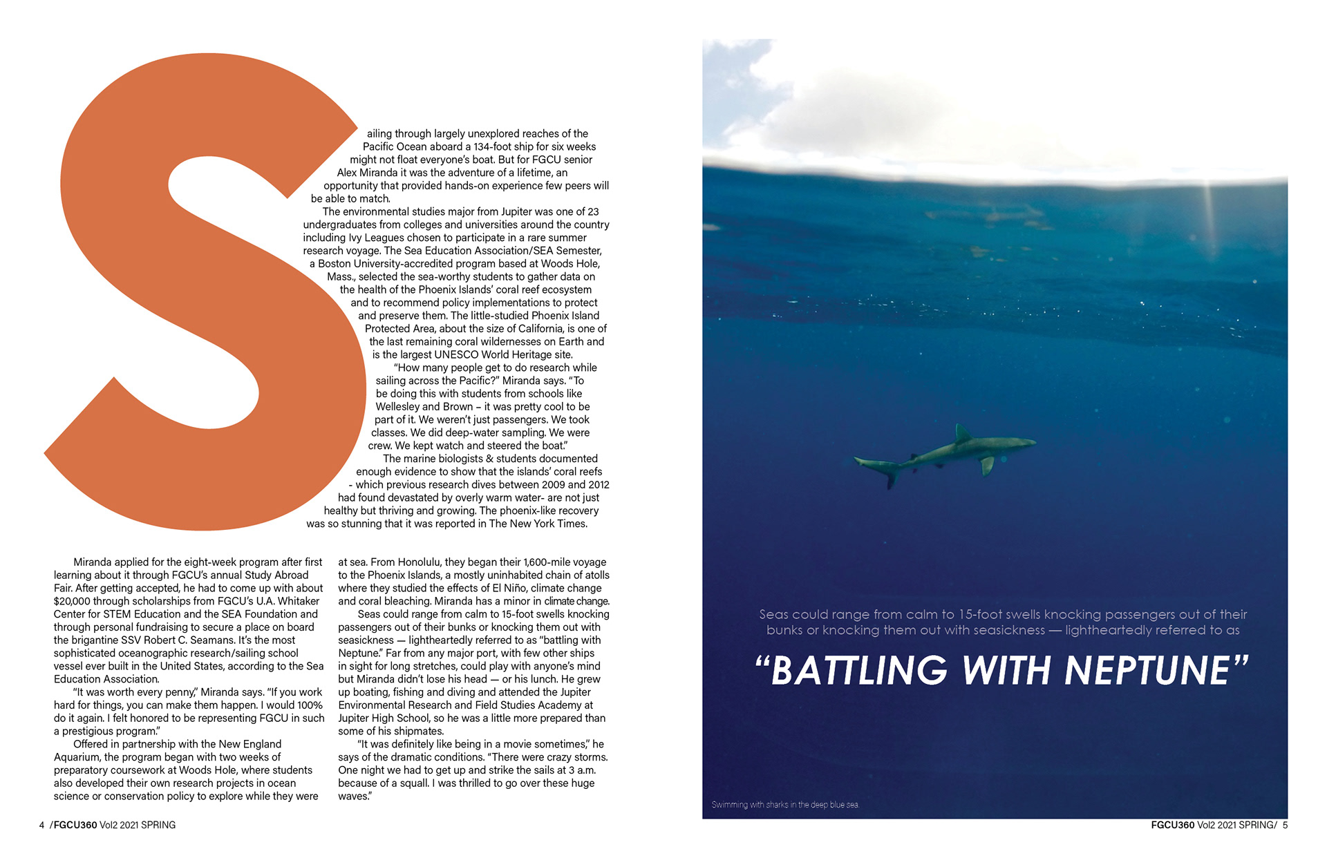
Following the warm theme of the first page, my color palette throughout was a bold orange color, with some bright blue photographs to contrast it. For this second page spread I wanted to experiment with how large I could make the drop cap while still keeping the page looking balanced with text. As you can see, I was able to have it cover almost have of the page area. I think having such a large cap leads the readers eye to the beginning of the article.
...........................................................................................................................................................................
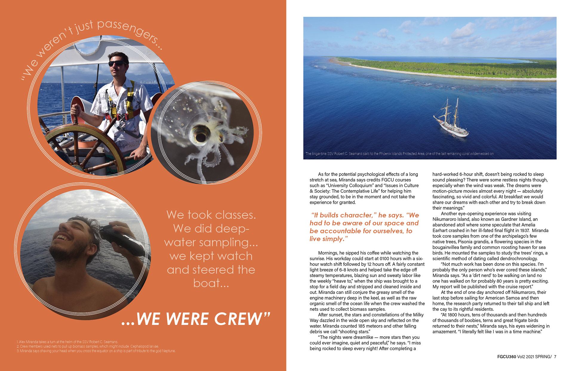
On this left page, I struggled with where to position the large quote that I wanted to feature. Originally I had it placed across the two-page spread, but that disconnected the quote and was not easy to read. So I kept it all on the same page, however if I were to continue to work on this project, I would go back and try to find a way to place the quote in a more uniform way around the images, because right now the first part wraps around the images but the second part does not, and I feel that this still makes the quote appear disconnected.